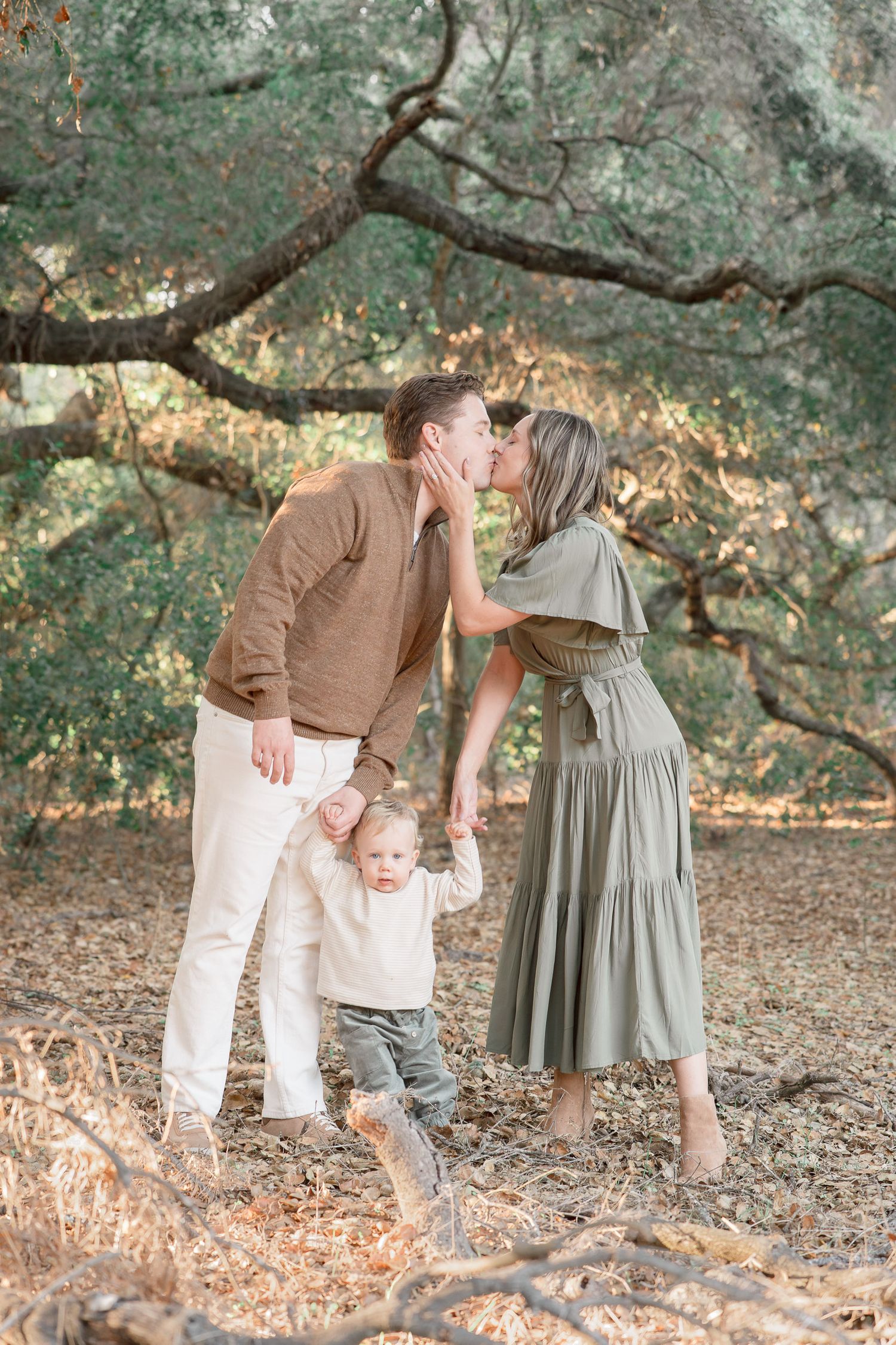
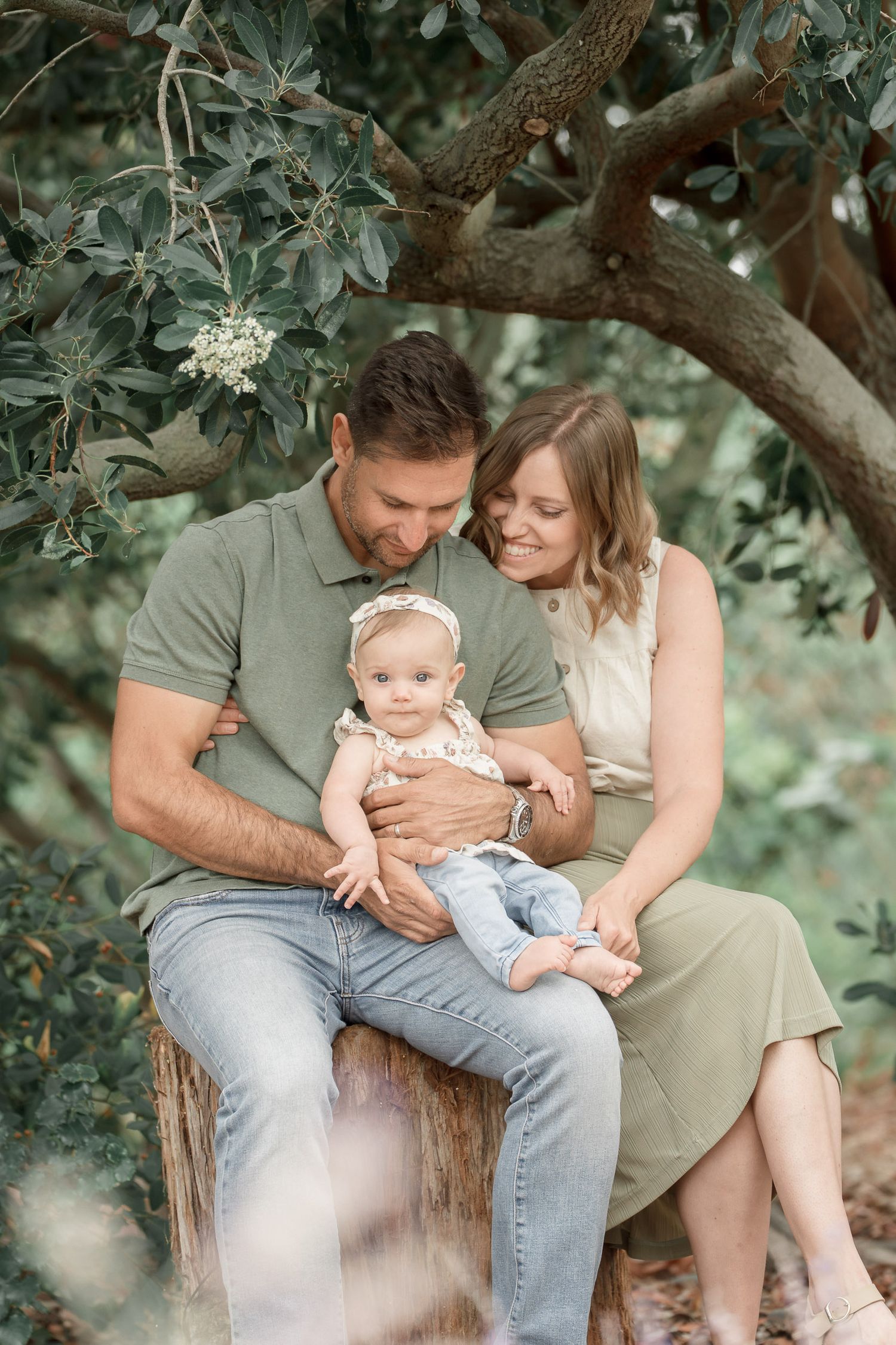
If you’ve spent any time around me, you may have noticed that I have a bit of a thing for green.
My phone case is green. My camera bag is green. My car is green. At this point, I probably don’t need much more evidence that it’s my favorite color—but somehow, it keeps finding its way into my life. And, naturally, it finds its way into my photographs, too.
As an Orange County family photographer, I spend a lot of time photographing families outdoors throughout Southern California. From coastal beaches and open fields to gardens, trails, and leafy parks, there’s usually quite a bit of green making its way into the frame.
And I pay very close attention to it when I’m editing.
Green Is Rarely Just Green
When I’m working through a family gallery, color is one of the first things I notice. And greens can be especially tricky.
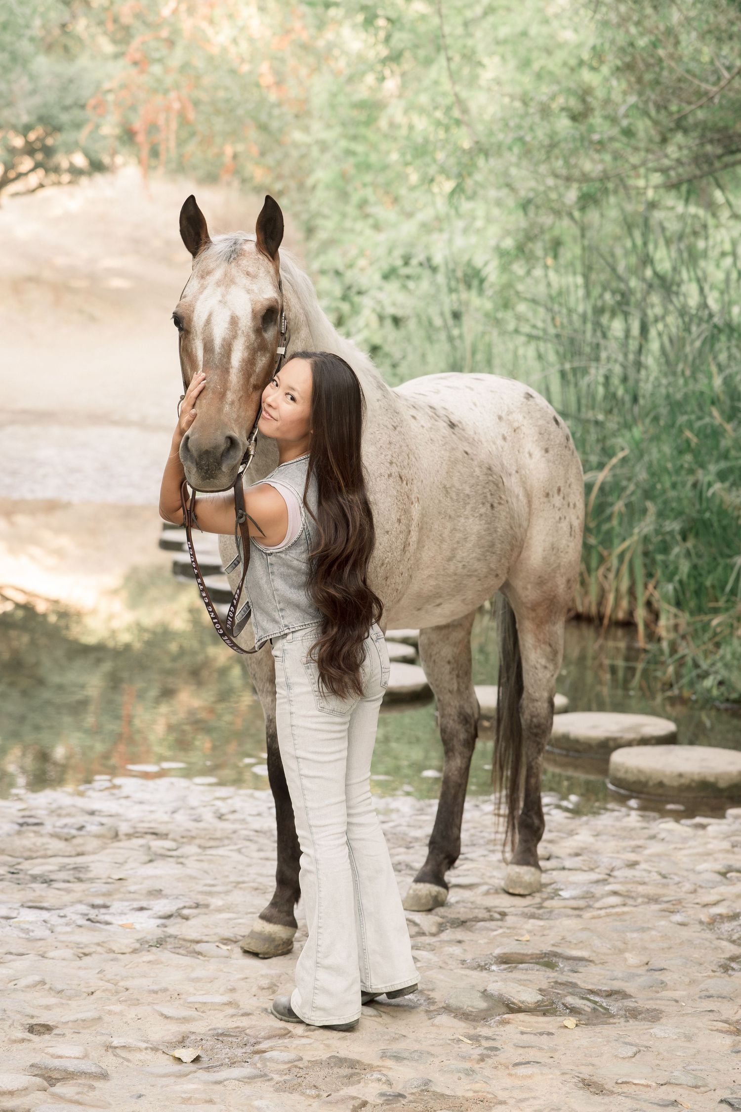
Straight out of camera, foliage can sometimes lean bright, yellow, blue, or overly saturated. None of those things are necessarily wrong—they’re simply starting points. The same location can feel completely different depending on how those colors are treated.
That’s where the edit comes in. I don’t want to erase the green. I love the green. I want it to feel like green—just softer, quieter, and a little more considered.
Because the goal isn’t to make every location look the same. It’s to make the colors within each photograph feel like they belong together.
My attention to color also comes from another part of my creative work.
Alongside photography, I’ve spent the past 16 years working in graphic and brand design, where color theory, visual harmony, and creating cohesive visual languages are a huge part of what I do.
When you work with color long enough, you start noticing the little things. How one shade can make another feel warmer. How a bright background color can pull your eye away from the subject. How a subtle shift in saturation can completely change the mood of an image.
That perspective naturally follows me into my photography.
I’m not simply applying the same filter to every photograph and calling it finished. I’m looking at the image as a whole and considering how the colors work together.
A Designer’s Eye for Color
Color Harmony Changes the Feeling
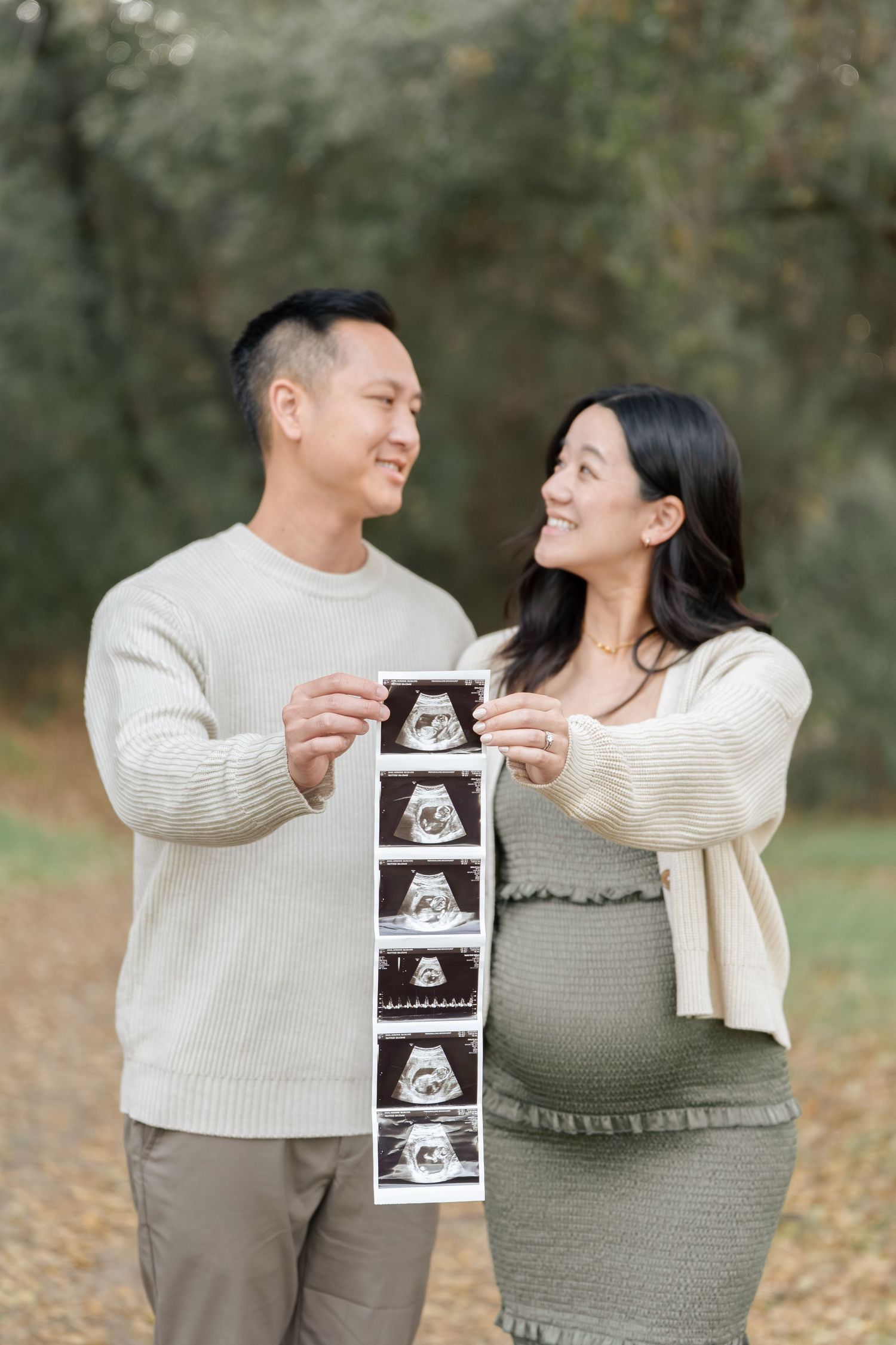
This is the part of editing I love most. A photograph can have beautiful natural light and a meaningful moment, but color influences how we experience all of it.
Warm skin against softened greens feels different than warm skin surrounded by bright, saturated foliage.
A quiet, muted palette can make an image feel nostalgic and calm. A punchier palette can make that same moment feel energetic and immediate.
The moment hasn’t changed. The feeling has. That’s why I don’t think of editing as simply making a photograph “look better.” I’m making decisions about how I want the finished photograph to feel.
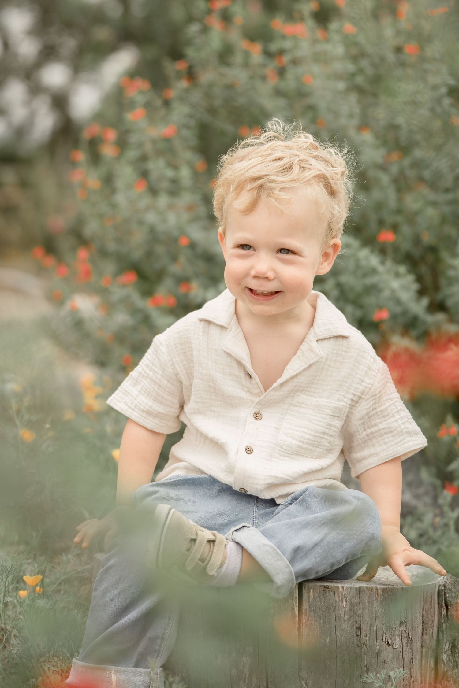
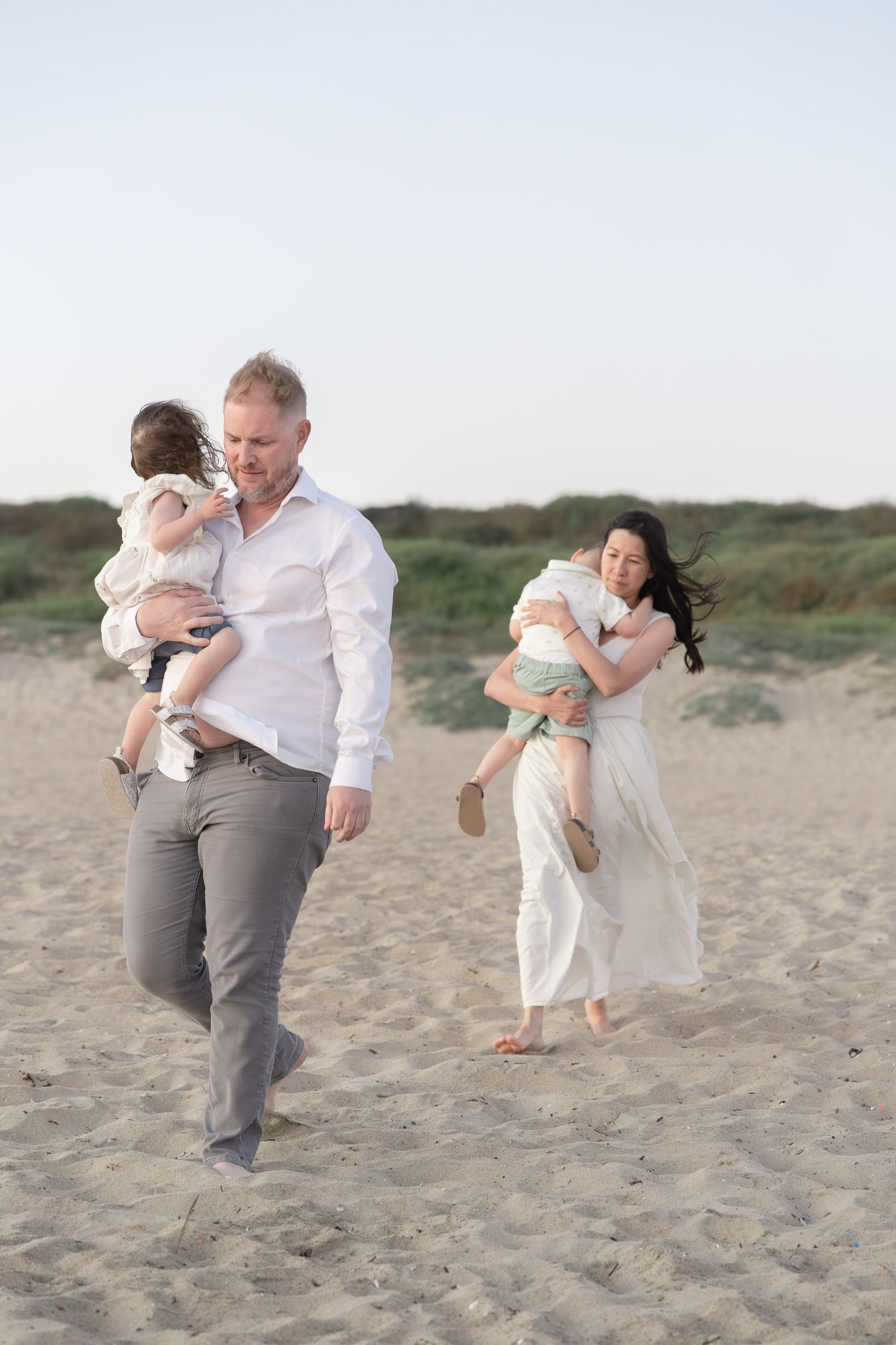
Every Color Gets a Seat at the Table
And it doesn’t stop at green.
When I edit an Orange County family photography gallery, I’m looking at the entire palette: skin tones, clothing, the sky, the background, the light, and even the tiny colors you might not consciously notice.
Warm skin. Soft tones. Gentle highlights. Muted surroundings.
The goal is for everything to work together without any one color shouting louder than the people in the photograph.
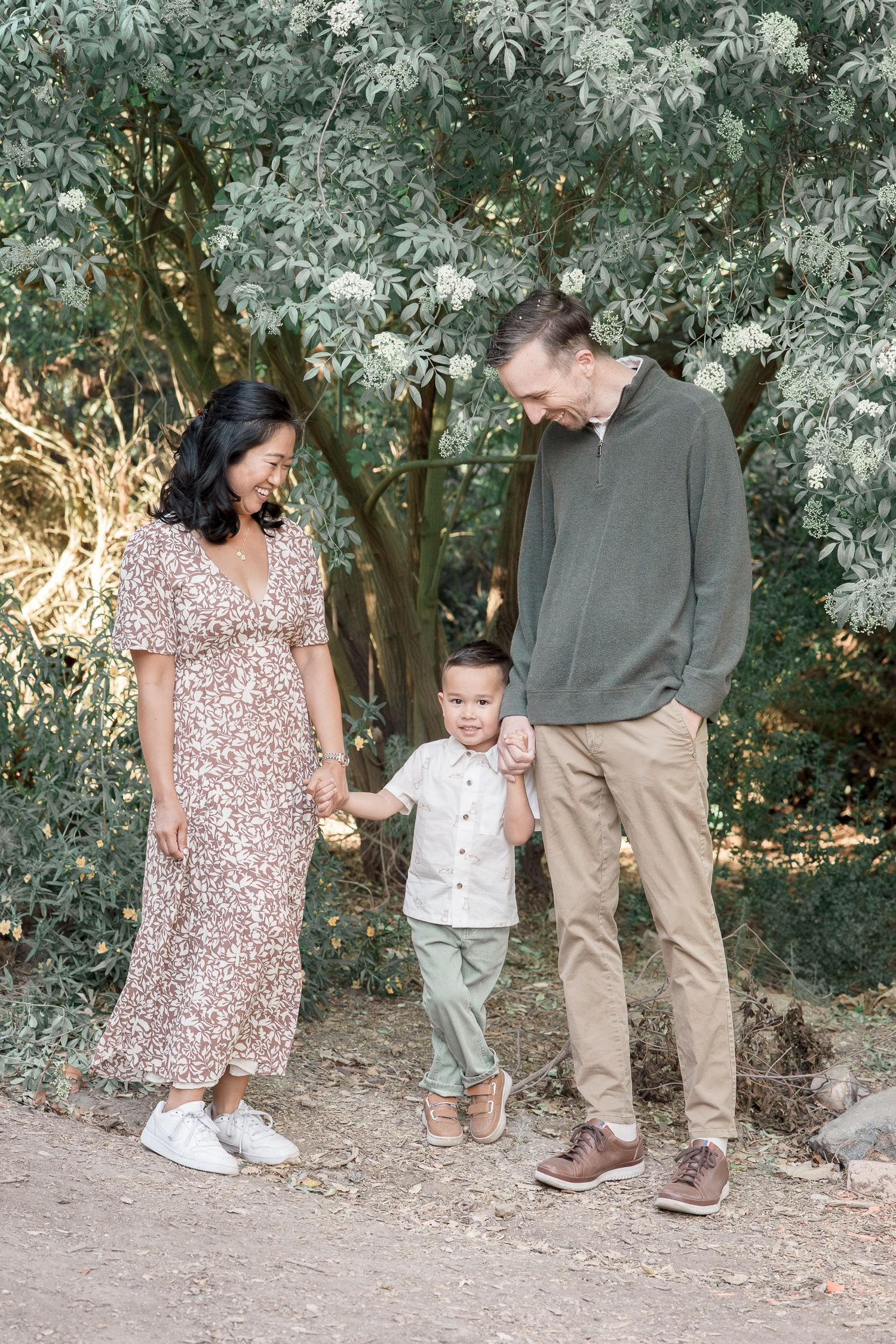
That’s why you’ll often see a soft, muted quality throughout my work. It’s not about removing color or making everything beige. It’s about refining the colors that are already there and giving them room to breathe.
Whether I’m photographing a family at the beach, in one of Orange County’s beautiful parks, or in the comfort of their own home, I want the finished gallery to feel cohesive from beginning to end.
I’m Not Chasing Trends
Photography trends come and go. Editing styles do, too.
I want my work to have a recognizable, cohesive look—but I don’t want that look to be tied to whatever editing trend happens to be popular right now.
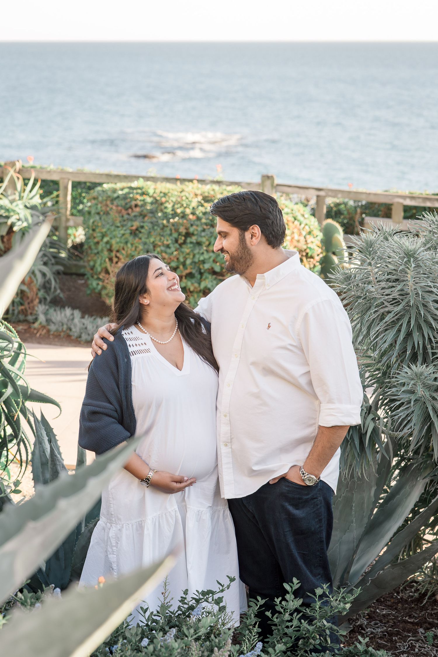
Instead, I’m drawn to warm light, softly muted color, gentle contrast, and a subtle sense of nostalgia.
Not because I want every photograph to look exactly the same. Because I want them to feel timeless.
I’m Not Just Editing for Today
This is ultimately why I care so much about these seemingly tiny details.
I’m not thinking only about the moment when I send your gallery. I’m thinking about the photograph five years from now. Ten years from now. The version of you who finds it tucked into an album or sees it hanging on the wall and is suddenly transported right back to that season.
I don’t want you looking at your Orange County family photos years from now and thinking about what editing trend was popular when they were taken.
I want you to remember how it felt. The way your little one fit against your chest. The way everyone laughed. The afternoon light. The feeling of having everyone together, exactly as you were in that season.
The edit should disappear. The feeling should stay.
That’s the heart of the Simply Archived edit: warm, softly refined color with just enough nostalgia to make a photograph feel like a memory.
And yes, I’ll probably always notice the green. 🌿
A Note From a Local Mom & Photographer
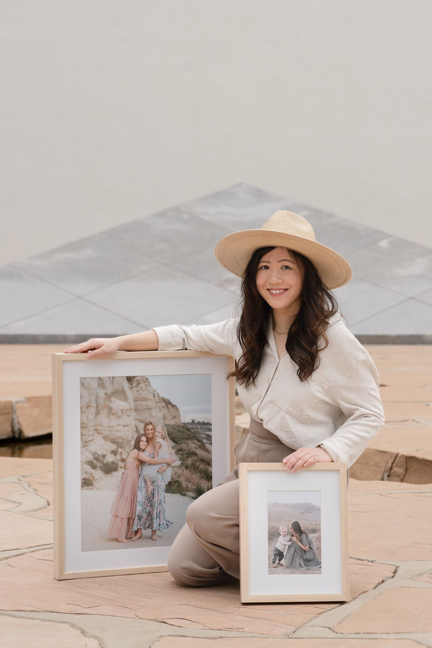
If you’re searching for an Orange County maternity photographer who cares about both the feeling and the artistry of your photographs, I’d love to help you document this season.
From the way I guide you through your session to the way I thoughtfully refine every image afterward, every detail is considered with the finished photograph in mind.
And just like every photograph I create, I’m thinking beyond today—creating timeless images you’ll love looking back on for years to come.